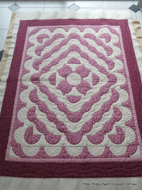
I developed a sort of love/hate relationship with the quilt I am currently quilting. This is one of the charity quilts I am doing for the Orange Tree Quilters group. Initially I thought...great, will put some feathers in the open spaces...no worries!
Well, wrong...The little blocks are merely 3in and arranged in an somewhat unusual way. While I could have done one feather display in the white space around the center elements, that idea fell to bits when I looked at the surrounding areas. Repeating a similar feather would have been difficult in the next space and in any case they would have ended up a bit small in places. Then looked at different feather designs, different ways to arrange them, but nothing really worked. I think after that I looked at alternating feather surrounds, i.e. some feather work in the white spaces alternated with some sort of filler. Drew that out but still did not like it.
I think after all that I just kept looking at this quilt. Quite like it, the fabric is really cute and I like that dusty pink colour. This would have taken ages to construct and I did want to honour the maker by chosing something that would suit and highlight the design. The day before yesterday I thought I might echo around the dusty pink shapes...great idea on paper, however in reality none of the curves are exact, so following that with a circle would have meant a lot of fudging, aligning and would then highlight some of those little imperfections.
Yesterday then I thought that this is ridiculous...there has to be a solution! I needed something that I could put into those spaces which was flexible enough to be extended or shrunk as needed and fitted in the repeating spaces while at the same creating some unity. In addition it needed to be a quasi standalone design that could end in a pleasing manner in all three spaces.
This is what I have come up with
Photo is a bit dark...it's cloudy and rainy over here.
Well, decided on a scroll. Did the center motif first. This is a stencil from Cindy Needham's Border stencil package. Particularly like that one and was fixated on using it. So I repeated that in the semi border around the main design. The scroll is a very old stencil that I forgot that I had. Fitted perfectly into the white space surrounding the center and was flexible enough to be massaged into the second and third white space. Having it in the middle also meant that differences in the available space did not become that noticeable and given its odd spaces it was easy to align because nothing really matched (hard to explain but there were some surprising discrepancies). The only thing that could have been done better is that I did not stitch every seam down...I went around the pink bits to secure the quilt rather than do every single seam (because initially I thought that all the white bits would be stitched down with feathers).
Almost done...will do a simple feather border and then it is done.
This certainly gave my brain a workout and a half!


